Getting Codex to build UI that fits your app
Turn your app’s design into a reusable Codex skill.
A common problem when working with coding agents is getting new features to match the design of an existing app. The feature may work, but the layout, spacing, or controls can feel out of place.
An approach I found useful was to have Codex study the app and turn its design decisions into a reusable skill. This tutorial shows how to create one in your own codebase, then compares the same feature built with and without it.
1. Use your existing app as context
Give Codex access to both the source code and rendered screens so it can connect the design to the components and styles behind it.
For your app, open the repository in Codex and choose a few screens that show different layouts and interaction states. You can provide screenshots or browser access. If you know where the shared components, styles, and design tokens live, point those out too.
2. Extract a design skill
Ask Codex to save the design rules as a skill. A skill stores reusable instructions in SKILL.md and can include supporting references. Repository skills can live in .agents/skills/.
Use this prompt, replacing the screenshot folder with your own:
1
2
3
4
5
6
7
8
9
10
11
12
13
14
15
16
17
18
19
20
Use $skill-creator to create app-design in .agents/skills/app-design/.

Study the existing screens in reference-screens/ alongside their source.
Turn the design into practical implementation rules, not a brand essay.

Identify the few patterns that make this app recognizable. Reference
actual components, selectors, tokens, and assets with relative paths.
Record concrete proportions, spacing, hierarchy, and interaction states,
including what should stay unboxed or undecorated.

Distinguish promotional layouts from task-focused forms and summaries.
Explain how to compose new screens around the user's task while reusing
these patterns. Prioritize clear choices, useful information density,
and one obvious next action. Avoid adding slogans, overlines, or other
decoration just to make a screen look branded.

Keep SKILL.md under 500 words, with only essential supporting references.
Separate observed rules from recommendations. Include a short visual
review checklist. Validate the skill. Do not build a new screen or
change the app yet.
When you review the skill, look for references to real components and useful decisions, such as how forms are grouped or which actions deserve emphasis. If it misses something, ask Codex to revise it using examples from your app.
3. Build a feature in a fresh chat
Start a new Codex chat in the same repository and describe what users need to do:
1
2
3
4
Use $app-design.

Add [feature] to this app. Users should be able to [describe the
required actions and behavior].
Check the result against your existing screens and try the feature yourself. To compare, run the same request without the skill in a separate, fresh chat. Start both runs from identical copies of the app.
Example: build your desk kit
Example Store is a fictional stationery store with original branding and artwork. It has cobalt blue headings, warm paper colors, oversized serif type, and illustrated products.
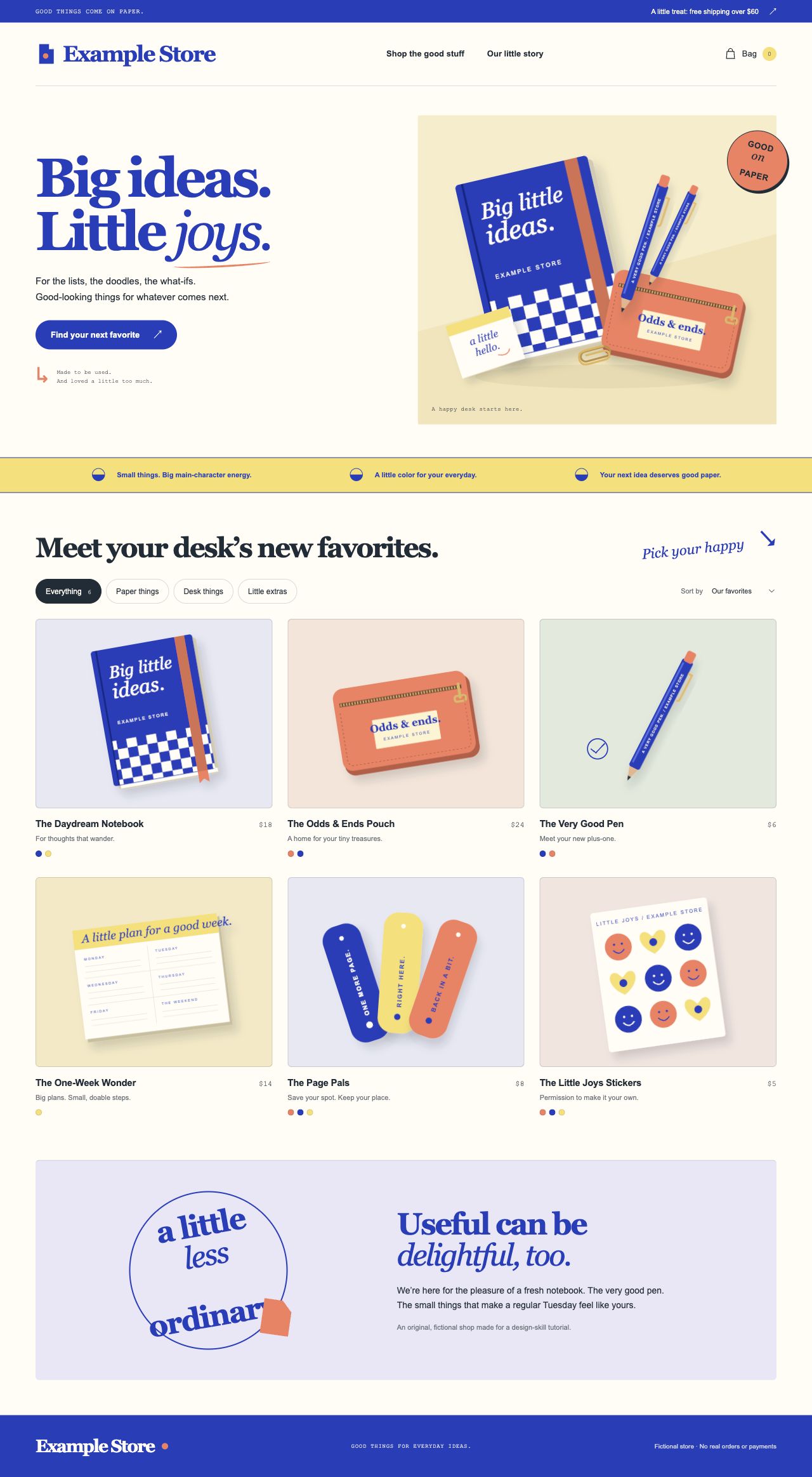
Scroll within the image to explore the homepage.
The new feature lets shoppers assemble a desk kit, choose colors, add gift wrapping and a message, and put the kit in their bag.
Both runs started with identical source code and screenshots in fresh, independent contexts. Both received the same feature request:
1
2
3
4
5
6
Add a "Build your desk kit" page to this store and link to it from the shop.

Shoppers should choose one paper item and one desk item, optionally add a
little extra, and pick their colors. Let them add gift wrapping for $4
and a gift message. Show the total and let them add the kit to their bag.
They should be able to change their choices or start over.
The only prompt difference was Use $app-design. in the run with the skill.
The generated skill and both implementations were left as Codex produced them.
Without the skill
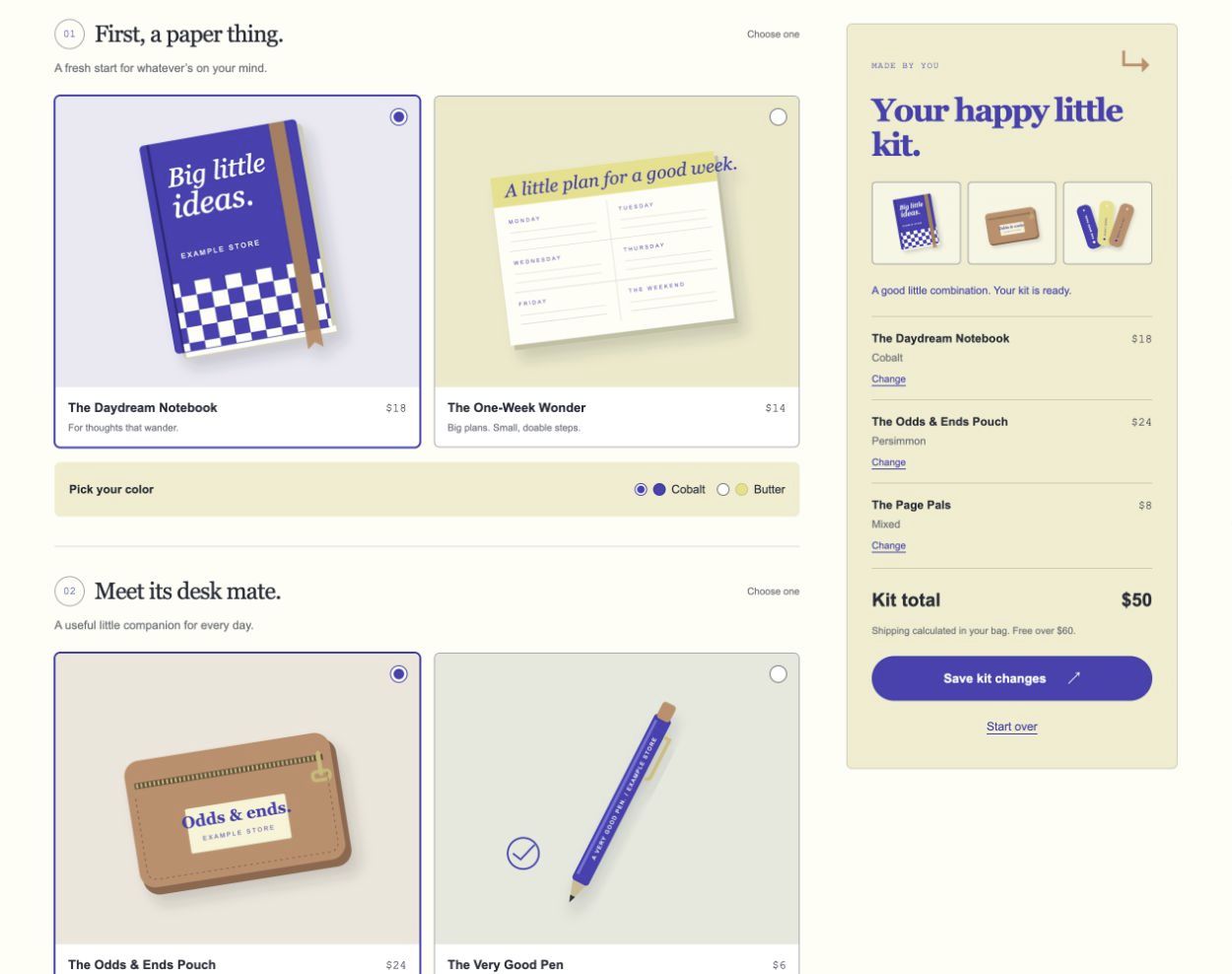
The page already carries over the store’s colors, type, and illustrations. The summary is harder to scan because the thumbnails sit apart from the product names and colors. Large product images leave less room for details, while the yellow summary adds promotional copy to a screen meant for choosing products.
With the skill
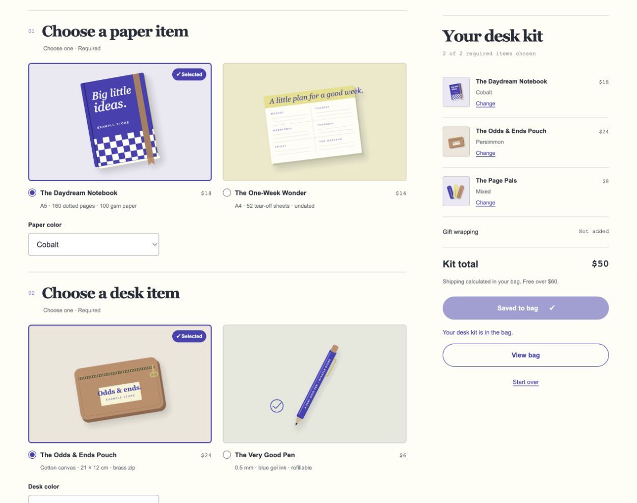
The skill version keeps the homepage’s cobalt accents and product details outside the image panels. Smaller images leave room for specifications, while “Selected” badges make choices easier to spot. Each summary thumbnail sits beside its name and color. “Saved to bag” confirms the action, and “View bag” gives shoppers a clear next step.
Both screenshots show the same three products saved as a $50 kit, with the header scrolled out of view, at the same viewport size. Browser checks covered selection, pricing, gift options, bag actions, reset, keyboard controls, and mobile layouts in both versions. This is one comparison, so check the results in your own app.